Gina Burdass and Kevin Laycock: New Paintings
-

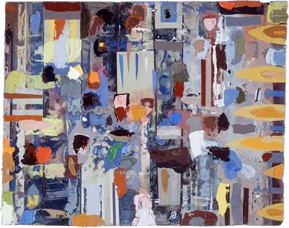
Kevin Laycock
oil on paper
30.5 x 30.5 cm
-
Kevin Laycock
Rashton
oil on paper
25.5 x 25.5 cm
-
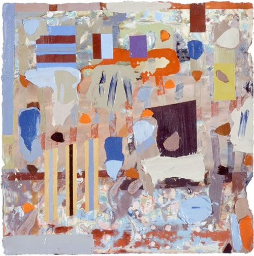
Kevin Laycock
RJHH
oil on paper
45.7 x 58.5 cm
-
Kevin Laycock
Tamsin
2004
oil on paper
38.5 x 48 cm
-
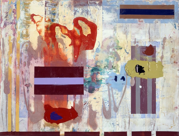
Kevin Laycock
(or Cosmic Trifle)
oil on paper
71 x 50.8 cm
-
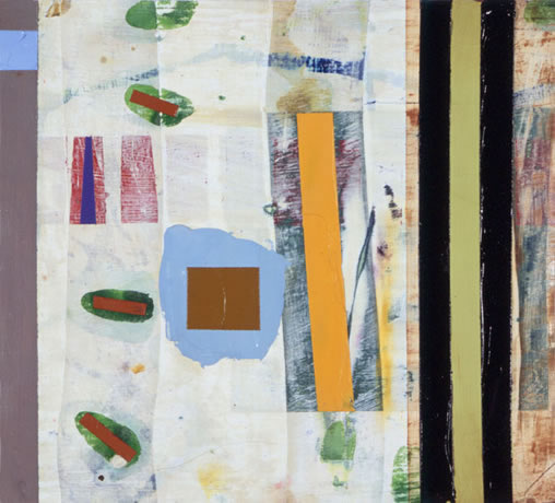
Gina Burdass Pull
2003
acrylic on super flax
68.5 x 114.5 cm
Gina Burdass and Kevin Laycock
New Paintings
24 February - 18 March 2004
Front Room
Our Front Room exhibition is the work of two exciting abstract painters, Gina Burdass and Kevin Laycock. Both explore perception and complexity of colour. Both play with structure. Both at times have been impressed with the work of Bridget Riley. But there any similarity ends. Their imagery could not be more different.
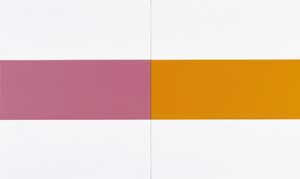
Gina Burdass invents her palette by making her own hues. Her recent paintings have used, generally speaking, a limited number of colours chosen from a broad spectrum. Set between two bands of white, itself a colour unlimited in its variety, resonates a single, specifically selected colour. Painted in series, each canvas with its own individual central band of colour, Burdass investigates the way that these colours relate to each other.
In my paintings I try to bring out the differences in the colours through their interaction and, whilst allowing each colour to retain its own distinctive character, not let any one colour dominate and shatter the unity.
Alternatively, a band of white is set between two colours, again, juxtaposed with similar canvases. These minimal works are contemplative, tranquil images. They ask of us how we ourselves perceive colour and, in consequence, what effect colours have on us.
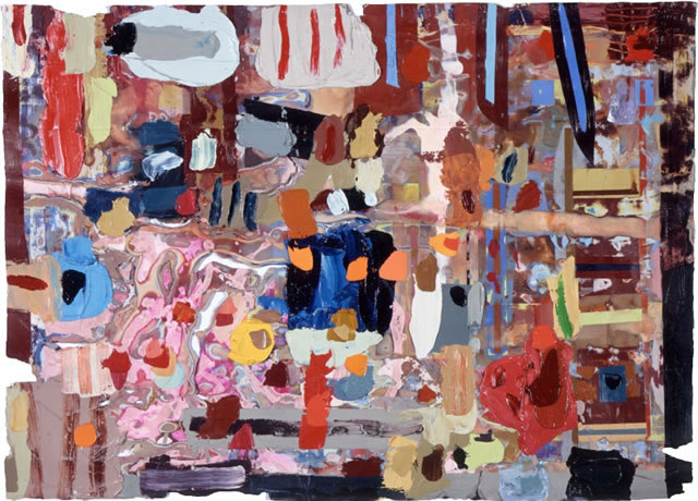
Kevin Laycock is also a talented colourist, and very involved with colour harmonies and relationships. However his imagery, in this new series Five Characteristic Pieces, is much more complex and heavily patterned. Each mark, each colour is carefully applied, building up an image over a long period of time. He is well versed in colour theory (as is Burdass) and his choice of palette reflects his use of complimentary colours. He constructs images by layering brushstrokes, working these into a grid-like structure which can echo tapestry, quilt or other forms of textile design. Sometimes the marks can be loose, sometimes very precise, but they combine to create stunning visual effects that, in music terms, really sing. They are tightly controlled and balanced, with so much detail that one is never likely to grasp the whole in one viewing.